Libby
Project: RMIT UX Design Course Final Project
Role: Student | UX research and product design
Overview: Libby is an app that gives users access to their local library's digital catalog. Users can borrow books, save curated lists, read e-books, and listen to audiobooks directly from the app.
Problem Statement
Libby users want to maintain a regular reading habit but they often forget to engage with the app over time. They may instead spend time on less satisfying activities like browsing social media. Reading can offer a respite from the distractions of daily life.
Goal: To help Libby users develop and maintain a regular reading habit by making the app a more engaging experience. This involves featuring reading statsitcs, improving how Libby surfaces library recommendations to a user, through to borrowing, reading, and returning a book.
User Research and Usability Testing Round 1
I conducted qualitative interviews and usability testing with two Libby users--one casual user and a super user--to understand the challenges and motivations each of them face when using the app. Data was captured on digital post-it Miro boards which were used for affinity mapping. Below are examples of comments captured during interviews.
Insights
Libby users are seeking an escape. The abililty to lose yourself in a book is the best motivator to keep reading.
Libby users seek to curate and customise their best book reading experience.
Reading status and notifications are effective at spurring users to actions in Libby. They may help with users who forget about their books.
Design Decisions
Feature books on home page that are recommended based on their reading history, holds shelf, and To-Read list. Users can easily find books curated for their interests and jump into something new.
Allow users to tag books and add them to a To-Read list.
Visualise reading status of current books by including a large pie graph on home page. Include reading stats after users return books to show how long it took them to read, how many times they opened it, etc. That way, users are encouraged to return to the app and continue reading their books.
Ideation: Crazy 8’s and Storyboards
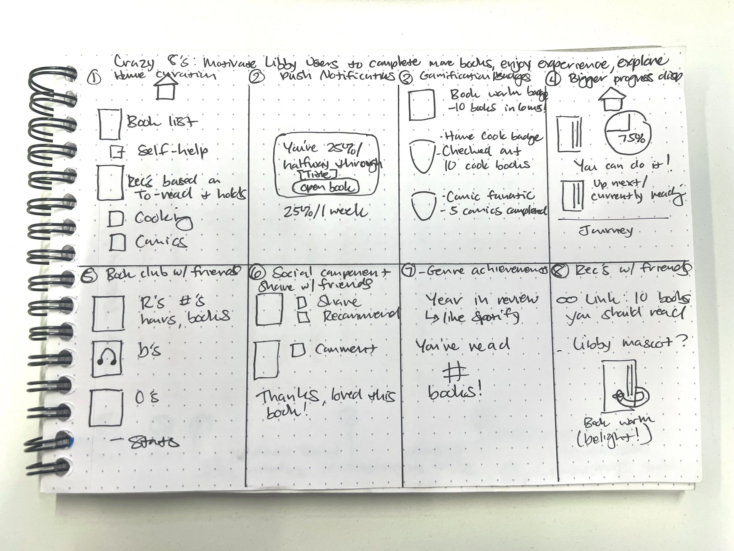
I conducted ideation excercises like Crazy 8’s and storyboards to visualise how I could implement the design decisions obtained during the user research phase. I enjoyed coming up with different ways to motivate people to create habits--like gamification and a social network--even if that would be beyond the organisation’s budget to implement in the real world. I found that many of these ideas were small enough improvements to the app that I could incorporate many of them into my prototypes.
Crazy 8’s
Storyboards
Concept Design: Paper Prototype
I sketched out a low-fi paper prototype to test how users would perceive the design decisions I outlined from the user research and ideation phases. The test user found the experience delightful, and treated the paper prototype like a real app, by swiping and tapping on the “screen.” The paper prototype was quick and easy to create and it was helpful to see how the user reacted to the prototype in real time.
Low-Fi Wireframes and Usability Testing Round 2
I created wireframes of the improved workflow in Figma using the insights from the first round of usability testing and the paper prototype experience. I conducted a second round of usability testing with the clickable low-fi wireframe prototype. I repeated the process of affinity mapping user feedback and synthesis to gather insights.
Insights
Users appreciated the new curation of the home page--they could see at-a-glance what they're reading, what's on their To-Read list, and recommendations based on their interests.
Users found delight in seeing their reading progress and usage stats.
Users appreciated the straightforward buttons and actions they could take without navigating to other screens.
Users were interested in including social interactions like sharing books, seeing/writing ratings and reviews.
Mid-Fi Prototype
The wireframes proved to be a simple and quick way to iterate different designs based on user feedback. I iterated a mid-fi prototype based on the insights I gathered from the second round of usability testing and affinity mapping.
Hi-Fi Prototype
I iterated a hi-fi prototype to better reflect user preferences and simulate a more realistic experience for the end user.
You can test out the prototype by clicking the button below or on the photo to the right.
Please test it by checking out the book titled “Crying in H Mart.”
You can also flip through pages and return the book.
Outcomes & Lessons Learned
This course and project showed me that UX/UI design is the type of work that I want to pursue in my career. I love interacting with people to design user-centred products and services.
I especially enjoyed the interview and usability testing phases where I observed users interacting with Libby. I enjoyed the conversational aspect of interviews and asking clarifying questions to better understand their pain points and behaviours.
During the synthesis phase, I uncovered underlying user motivations that weren’t initially clear from testing. Those kinds of discoveries felt rewarding because I knew I was designing the best experience for the user. It was satisfying to see how each user reacted to the improved flow when testing the low-fi wireframes. Users enjoyed the new design and found it delightful.


